Web2026Live
assoli.site
My previous portfolio: one animated page, driven by a command menu.
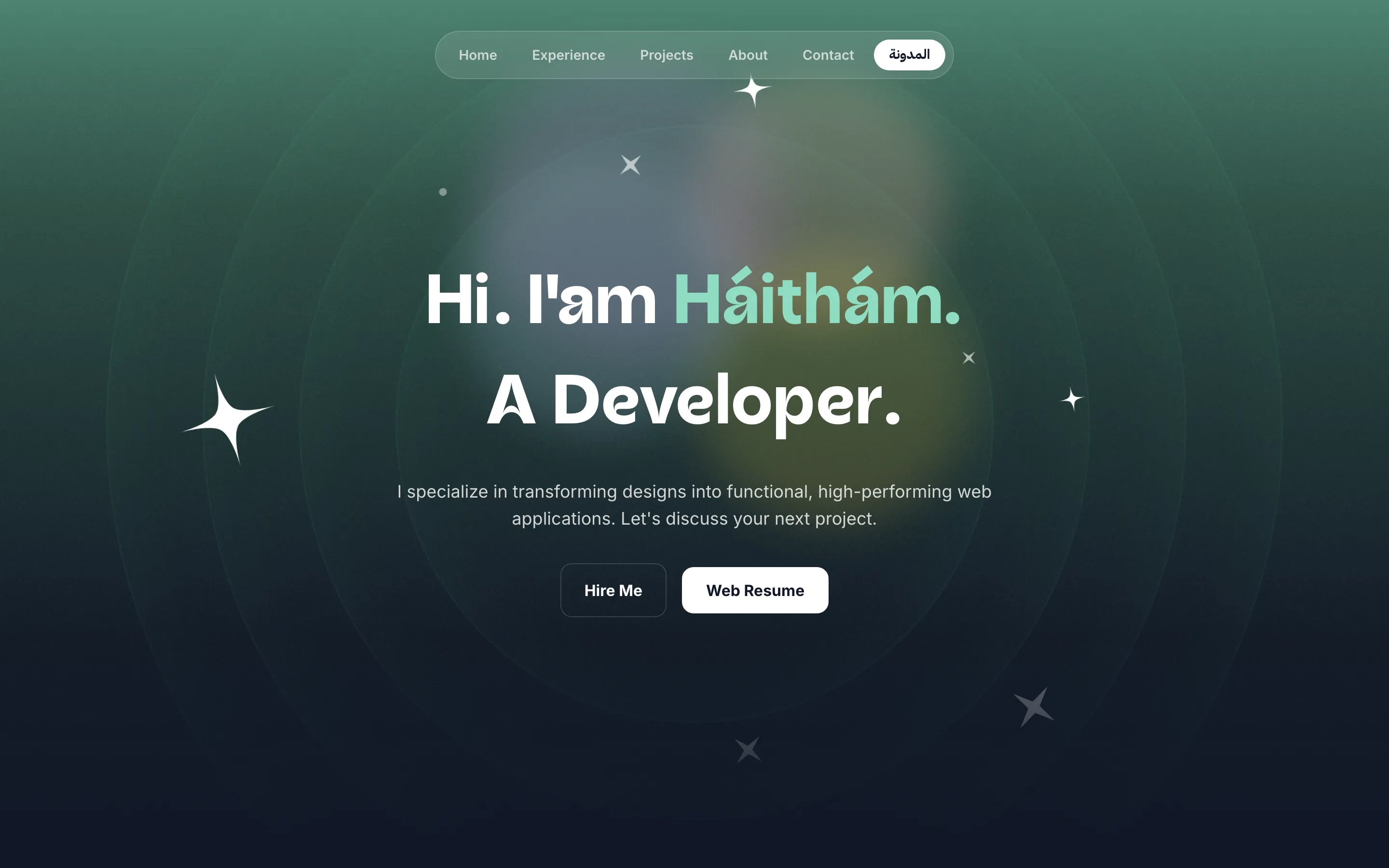
The portfolio that came before this one: a single animated page with a command menu, built to be looked at rather than read, and to make the first two seconds count.
What it is, and why it exists
A portfolio is the pitch, not the reference. This one is animated, opinionated and built to be looked at, with a command menu instead of a navigation bar so the whole site is one keystroke deep.
Keeping it apart from the résumé meant it never had to compromise: it can be heavy on motion without making a recruiter fight it for the facts, because the facts live on their own site.
Challenges
Motion that does not cost the first impression
the problem
A portfolio is judged in the first two seconds, and that is exactly the window that heavy animation and font loading spend on themselves.
what I did
Content is readable before the animation resolves rather than gated behind it, so a slow connection degrades to a plain page instead of a blank one.
Results
- A motion-led single-page portfolio, navigable entirely from the keyboard.
- Now being replaced by this bilingual rebuild.